My 5 favorite PSB single sleeves
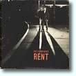 |
1. "Rent" Photographer - Eric Watson; Design - Mark Farrow and Pet Shop Boys Dramatically backlit in the nighttime darkness of a railway station, casting long, deep shadows in our direction, Neil and Chris stand glaring at us in striking black and white, looking more than a little like rough trade. It's perhaps the single most sexually charged photo ever taken of them, especially with regard to Chris's aggressive, spread-legged stance, partially obscuring Neil. Is it any wonder that, all things considered—including, of course, the lyrics—more than a few people assumed the song was about male prostitution? |
 |
2. "It's a Sin" Photographer - Eric Watson; Design - Mark Farrow and Pet Shop Boys Like a still from a somewhat arty film set on the wrong side of the tracks, it essentially invites you to devise a plot to explain the situation depicted there. From what I've read, that's precisely the effect they and photographer Eric Watson were going for. |
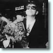 |
3. "Where the Streets Have No Name (I Can't Take My Eyes Off You)" Photographer - Lawrence Watson; Design - Mark Farrow and Pet Shop Boys A "discovered" shot—not posed but taken spontaneously by photographer Lawrence Watson at Tokyo's Narita Airport during the MCMLXXXIX Tour—it captures Neil looking for all the world (and quite by accident) like an absolute snob, fairly dripping with millionaire pop-star snootiness. It's the sort of photo that most other pop stars would have done everything they could to suppress. Not our Boys. They graced the sleeve of a single with it, thereby ensuring it far greater exposure than it might otherwise ever have achieved. An utterly admirable form of chutzpah, that. |
 |
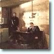
4. "Love Comes Quickly" Photographer - Eric Watson; Design - Mark Farrow and Chris Lowe Zoom in on Chris, his eyes mysteriously cast into deep, obscuring shadow by the brim of his "BOY" cap, unshaven, t-shirt, leather jacket, vaguely menacing. Love comes quickly, does it? It ranks right up there with the cover of Actually and the much later "Can You Forgive Her?" cone-caps as being among the most iconic PSB images ever. |
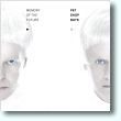 |
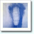
5. "Memory of the Future" Photographer - Pelle Crepin; Design - Mark Farrow and Pet Shop Boys My #5 slot boiled down to a toss-up between this and the sleeve of "DJ Culture." So what gave this one the final edge? Let's just say it makes me miss so very, very much a music video that was never made of Chris and Neil in the guises they adopted for this photo shoot. Ironically, I find myself longing not for the future but for a time past when undoubtedly such a video would have been made. Oh, yeah, it's kinda creepy, too—creepy in a good way—suggesting a sterile, clonish, virtually colorless dystopian future that no red-blooded human being would actually wish to inhabit. |
 |
Honorable Mention - The limited-edition 12-inch promo singles of "Before" and "The Truck-Driver and His Mate"
|
 |
All text on this website aside from direct quotations (such as of lyrics and of other nonoriginal content) is copyright © 2001-2024 by Wayne Studer. All Rights Reserved. All lyrics and images are copyright © their respective dates by their respective owners. Brief quotations and small, low-resolution images are used for identification and critical commentary, thereby constituting Fair Use under U.S. copyright law. Billboard chart data are copyright © their respective dates by Billboard Media, LLC.